
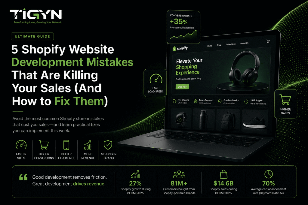
Most Shopify stores do not have a traffic problem. They have a conversion problem.
You can spend thousands on ads, SEO, and social content, and still watch sales stay flat. The reason is usually simple. Visitors arrive, hit friction, and leave. Good Shopify website development removes that friction so the traffic you already pay for turns into revenue.
This guide covers the five mistakes we see most often in Shopify builds, what each one costs, and how to fix it. Every fix here is practical. You can start on most of them this week.
What Is Shopify Website Development?
Shopify website development is the process of designing, building and optimizing an online store on the Shopify platform so it loads fast, works well on mobile, and converts visitors into buyers. It goes beyond theme installation. It covers site speed, product page structure, navigation, checkout flow, technical SEO and ongoing testing.
In short: theme setup makes a store exist. Development makes it sell.
Why Store Quality Matters More Than Traffic Volume
Traffic is expensive. Ad costs rise every year, and organic rankings take months to build. So every visitor who leaves without buying is money you have already spent.
Additionally, the scale of the loss is well documented. The Baymard Institute puts the average documented cart abandonment rate at roughly 70%, based on a meta-analysis of around 50 separate studies. That figure has barely moved in a decade. Baymard also estimates that better checkout and page design could lift conversion rates by an average of 35% on large e commerce sites.
Meanwhile, the ceiling keeps rising. Shopify merchants generated a record $14.6 billion over the 2025 Black Friday–Cyber Monday weekend, up 27% year on year, with more than 81 million customers buying from Shopify-powered brands. Demand is there. The question is whether your store is built to capture it.
Here is the practical takeaway. A 1% lift in conversion rate on existing traffic is usually cheaper and faster than a 20% lift in traffic.
Mistake 1: Slow Page Speed
Slow page speed costs sales because shoppers do not wait. Moreover, Google and Deloitte studied 30 million sessions across 37 brands. They found that a 0.1-second speed improvement boosted conversions by 8.4% and order value by 9.2%. That is a tenth of a second. The gap between a fast store and a slow one is usually several seconds.
Why Shopify stores get slow
Shopify’s hosting is fast by default. The slowdown almost always comes from what gets added on top:
- Too many apps, each loading its own scripts
- Uncompressed hero images and product photos
- Heavy sliders, video backgrounds and animation libraries
- Multiple tracking pixels and chat widgets firing at once
- Custom fonts loaded in several weights
How to fix it
- Run your store through PageSpeed Insights and check your Core Web Vitals. Google’s thresholds for a good experience are: largest contentful paint under 2.5 seconds, interaction to next paint under 200 milliseconds, and cumulative layout shift under 0.1.
- Audit your installed apps. Remove anything you have not used in 90 days.
- Compress and resize images before upload. Serve WebP where possible.
- Lazy-load images below the fold.
- Limit custom fonts to two families and two weights.
- Re-test after each change so you know which fix moved the number.
Business impact: faster pages mean lower bounce rates, higher add-to-cart rates and better ad efficiency, because you pay the same per click but convert more of them.
Mistake 2: Weak Product Pages
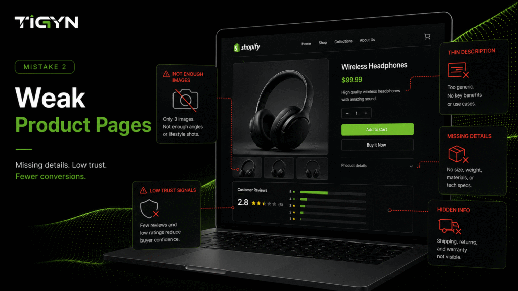
The product page is where buying decisions happen. If a shopper cannot answer their own questions there, they leave.
Baymard’s product page research found that 56% of test participants started by exploring the product images, before reading the title or description. Images are not decoration. They are the primary source of information. Baymard also found that around 10% of e commerce sites provide descriptions that are too thin for users to make a decision, which pushes shoppers to research elsewhere or abandon the product entirely.
What weak product pages usually look like
- One or two low-resolution images
- No sense of scale, texture or fit
- Descriptions written for search engines, not buyers
- Missing sizing, materials, compatibility or dimensions
- Shipping and return terms hidden until checkout
- No reviews, or reviews buried at the bottom
How to fix it
- Use six to eight images per product. Include a scale shot, a detail shot and a product-in-use shot.
- Add a short video or 360-degree view for higher-priced items.
- Open the description with three to five benefit-led bullets, then add full specifications below.
- Answer the top five questions your support team actually receives, directly on the page.
- Show shipping cost, delivery time and return policy above the fold or in a visible tab.
- Place reviews and ratings near the buy section.
Business impact: stronger product pages reduce pre-purchase hesitation, lower return rates and cut support volume, because customers know what they are buying before they order.
Mistake 3: A Poor Mobile Experience
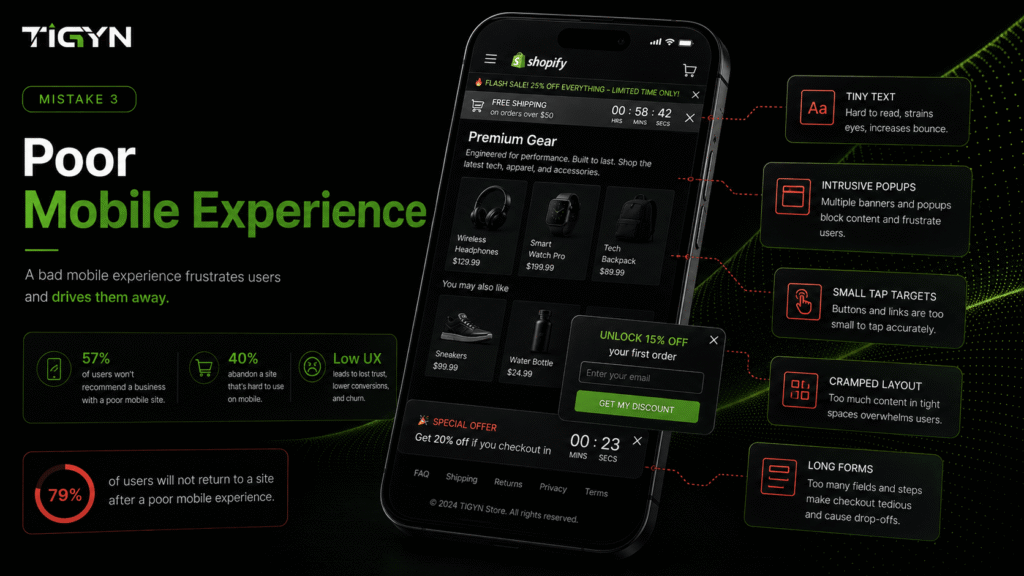
Mobile is where most e commerce traffic now lives, and where most of it is lost. Dynamic Yield’s benchmark data shows mobile carts are abandoned at roughly 80%, compared with about 66% on desktop. That gap is not a shopper problem. It is a design problem.
A store can look excellent on a 27-inch monitor and still be frustrating on a phone.
Common mobile failures
| Issue | What the customer experiences |
| Tap targets too small | Mis-taps, frustration, exits |
| Text under 16px | Pinch-zooming on every page |
| Sticky banners and pop-ups | Half the screen blocked |
| Long, multi-field forms | Checkout feels like paperwork |
| Desktop-sized images | Slow loads on mobile data |
| Hidden add-to-cart button | Extra scrolling to buy |
How to fix it
- Test your store on a real mid-range Android phone, not just a desktop preview.
- Make buttons at least 44 by 44 pixels.
- Use a sticky add-to-cart bar on product pages.
- Enable accelerated payment options such as Shop Pay, Apple Pay and Google Pay so shoppers skip form filling.
- Delay pop-ups until a shopper has scrolled or spent time on the page.
- Serve mobile-sized images.
Business impact: mobile optimization typically produces the single largest conversion gain available to most Shopify stores, because it fixes the channel with the biggest drop-off.
Mistake 4: Complicated Navigation
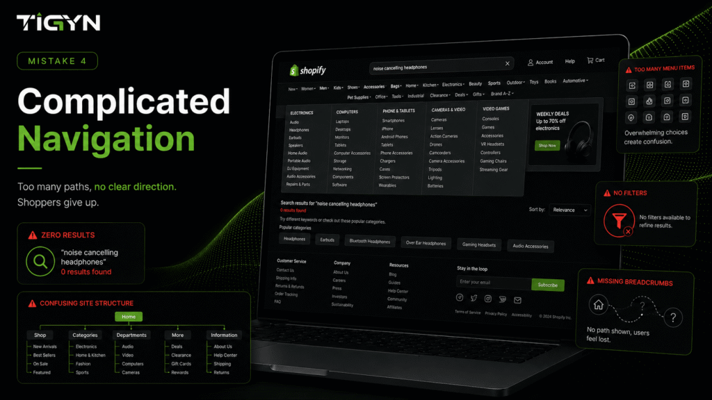
If customers cannot find a product quickly, they will not buy it. Navigation problems are quiet killers. They rarely show up as complaints. They show up as high exit rates on collection pages and low product page views per session.
Signs your navigation is hurting sales
- More than seven top-level menu items
- Category names based on internal jargon rather than customer language
- No search bar, or a search bar that returns poor results
- Filters missing on collection pages with 30+ products
- No breadcrumbs, so shoppers cannot step back a level
- Important pages buried three or four clicks deep
How to fix it
- Cut your main menu to five to seven clear categories.
- Name categories the way customers describe products, not the way your catalogue is organized.
- Add filters for the attributes people actually shop by: size, price, colour, material, use case.
- Turn on predictive search with product images in the results.
- Add breadcrumbs to product and collection pages.
- Review your site search reports monthly. Searches with no results tell you exactly what customers expect to find.
Business impact: clearer navigation increases products viewed per session, which lifts both conversion rate and average order value.
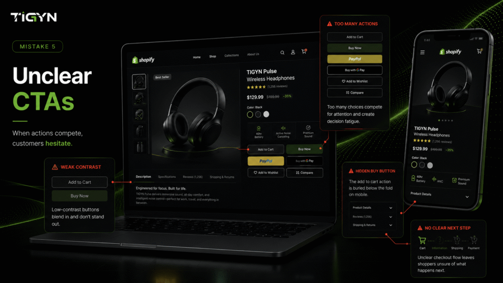
Mistake 5: Unclear Calls-to-Action
A call-to-action tells the customer what to do next. When it is weak, unclear or hard to find, momentum breaks. Baymard’s checkout research shows how sensitive this stage is: around 39% of shoppers who abandon for a fixable reason do so because of unexpected extra costs, while roughly 19% abandon because they were forced to create an account, and about 18% because checkout was too long or complicated.
Those are all CTA and flow problems, not product problems.
What weak CTAs look like
- “Learn more” or “Explore” where “Add to Cart” belongs
- Buttons that blend into the background
- Add-to-cart placed below the fold on mobile
- No confirmation after a product is added
- Several competing buttons in the same view
- No clear next step after the cart page
How to fix it
- Use one primary action per screen. Make it the highest-contrast element.
- Write plainly: “Add to Cart”, “Buy Now”, “Start Free Trial”.
- Keep the add-to-cart button visible while scrolling on mobile.
- Confirm the action with a slide-out cart, then offer a clear path to checkout.
- Show total cost, including shipping, before the final step.
- Enable guest checkout. Offer account creation after the order is placed.
Business impact: clear CTAs shorten the path to purchase and reduce checkout drop-off, which directly increases revenue per session.
Quick Reference: The Five Mistakes and Their Fixes
| # | Mistake | Business cost | First fix to make |
| 1 | Slow page speed | Lost conversions and wasted ad spend | Audit apps and compress images |
| 2 | Weak product pages | Hesitation and higher returns | Add 6–8 images and full specifications |
| 3 | Poor mobile experience | Highest drop-off channel | Test on a real phone, add sticky add-to-cart |
| 4 | Complicated navigation | Fewer products viewed per session | Simplify the menu, add filters and search |
| 5 | Unclear CTAs | Checkout abandonment | One primary action per screen, guest checkout |
What a High-Converting Shopify Store Actually Needs
A successful store needs more than products and a checkout button. Seven elements do most of the work:
- Performance — fast loads on mobile data, measured against Core Web Vitals.
- Purposeful design — layouts that guide attention toward the buy action.
- Mobile optimization — designed for phones first, then scaled up.
- SEO foundations — clean structure, product schema, fast indexing, useful content.
- Conversion-focused product pages — complete information where the question occurs.
- Customer trust — visible policies, reviews, secure payment badges and real contact details.
- Continuous improvement — monthly review of analytics, search data and checkout drop-off.
Most stores handle two or three of these well. The gains come from closing the gaps.
A 7-Day Plan to Audit Your Shopify Store
You do not need a full rebuild to start. Work through this order:
| Day | Task | Tool |
|---|---|---|
| 1 | Run a speed test on your homepage and two product pages | PageSpeed Insights |
| 2 | List every installed app and flag unused ones | Shopify admin |
| 3 | Review your three best-selling product pages against the checklist above | Manual review |
| 4 | Complete a full purchase on your own phone, start to finish | Real device |
| 5 | Check site search reports for zero-result searches | Shopify analytics |
| 6 | Map your checkout drop-off by step | Google Analytics 4 |
| 7 | Rank all findings by revenue impact and effort, then fix the top three | Team review |
Fix the highest-impact, lowest-effort items first. Re-measure after each change so you know what worked.
Frequently Asked Questions
How much does poor page speed really affect Shopify sales?
Significantly. Google and Deloitte’s research found a 0.1-second improvement in mobile site speed was associated with an 8.4% lift in retail conversions and a 9.2% lift in average order value. Because the effect compounds across every visitor, even small speed gains produce measurable revenue changes on stores with steady traffic.
What is a good cart abandonment rate for a Shopify store?
The documented average across e commerce sits at roughly 70%, according to Baymard Institute research. Anything meaningfully below your industry average is a good result. Rather than chasing a universal number, track your own rate over time and measure whether specific fixes, such as guest checkout or upfront shipping costs, move it.
Do I need a custom Shopify theme to increase conversions?
Not always. Many stores get strong results from a well-configured premium theme with targeted development work on speed, product pages and checkout. Custom development makes sense when you have unique product configurations, complex catalogue logic, or a brand experience a standard theme cannot deliver.
How often should I review my Shopify store performance?
Monthly for analytics, search data and checkout drop-off. Quarterly for a deeper review of speed, product page quality and navigation. Ecommerce is not a one-time build. Customer behaviour, devices and competitors all shift throughout the year.
Which fix should I start with?
Start with mobile. It carries the most traffic and the highest abandonment rate, so improvements there usually produce the fastest measurable return.
Turn Your Store Into a Sales Machine
Getting traffic is only half the job. The other half is making sure your store earns the sale once someone arrives.
At TIGYN, we build and optimise Shopify stores around five areas: performance, design, SEO, user experience and conversions. We start by identifying where your store loses buyers, then fix the issues that carry the most revenue impact.
Need help improving your Shopify store’s performance and conversions? TIGYN can audit your current store, identify the gaps costing you sales, and build the improvements that deliver measurable results.
Visit tigyn.com or email info@tigyn.com to start the conversation.